
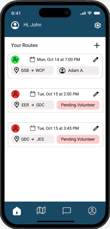
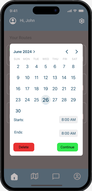
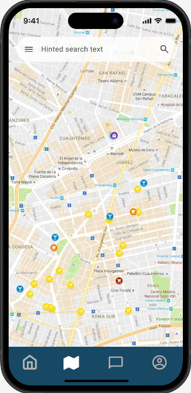
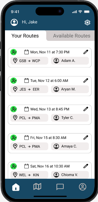
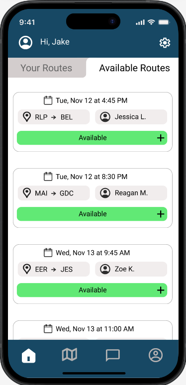
Goal: To design an accessibility-focused app that connects disabled UT Austin students with volunteers who can help them navigate campus barriers such as inaccessible entrances, heavy doors, or steep routes.
Currently in development with Longhorn Developers for it's launch at UT Austin.
Many students with mobility challenges struggle with the lack of accessible routes or reliable support when moving across UT’s large and often uneven campus. Current accessibility resources are limited, impersonal, or inefficient in real-time situations. Mobilize bridges this gap by creating a community-driven support system that empowers both students and volunteers.
Our team conducted interviews with disabled students and potential volunteers. We explored experiences related to physical barriers, communication frustrations, and emotional impacts of inaccessibility.
Mobilize was my first-ever Figma design project, and it taught me the fundamentals of translating an idea into a functional, human-centered product. One of the biggest lessons I learned was the importance of color theory and contrast. In hindsight, Mobilize's color palette is very basic, and doesn't set the app apart. Additionally, some colors don't provide enough contrast, making key elements less readable. I’ve since learned how crucial color accessibility is, especially in a product designed for individuals with disabilities. Despite its flaws, Mobilize remains a meaningful project because it represents my first step into UX design, a blend of empathy and problem-solving. It helped me develop a deeper understanding of inclusive design and motivated me to keep improving my craft through iteration and user feedback.